Lorem ipsum dolor
amet consectetur
adipiscing elit
ina pretium
For better and more secure ships, call
Intergalactic Spaceships Inc!
The purpose of this site is to help guide web designers to steer around common pitfalls and problems, encoutnered when the web developers are tasked with impelmenting them. Often, designs are signed-off by the clients, which, when rubber meets the road and the website is created, complain that the website doesn't match what they were presented in the design phase. These pitfalls often result in unanticipated budget over-runs.
These website projects have limited developer time available. Pitfalls can exhaust this budget, such as:
Desining a wide variety of different structures, instead of a smaller set of re-usable structures, cause extra work. These could be in-page widgets, or different types of pages entirely.
A 1000 page-website can take less development time (setting aside content/data entry) than a 5-page site, if the 1000-page site is just the homepage design, and a single subpage design/template that's re-used 999 times, rather than the 5-page site being comprised of 5 entirely different design layouts that each have to be independently developed.
It may not even be pages, but more subtle things like each top navigation dropdown panel having separate construction/functionality, or each hero-banner carousel slide being completely different fundamental design.
Each time the next design element is different than anthing previous to it, the new element requires new development.
This is unanticipating issues that arise between design examples, such as low and high resolution versions - placing the web developer into a situation where they may need to do ad-hoc graphic design to solve the problems, deviating from the approved design.
The developer could stop an ask for help, but this is frequently slower on the time schedule, and is more time consuming. Timewise, the developer can simply guess, and have a 90+% chance of being correct. It's more efficient than the developer needing to stop, craft a request, wait, have back and forth, get a decision back, craft more responses, etc, potentially hundreds of times. It's underestimated how many decision points and gaps can exist in a design beyond the look-and-feel version phase.
Most of the sections on this site are about conceptual gaps in the design.
This is not accounting for or leeraging front-end or back-end frameworks, and in the process, often "going against the grain". The designs may miss the fact that the design is to be integrated into a CMS at all, and the implications therein.
As such, it's good to review the intended front/back-end frameworks, such as what end components, or stylesheet properties that already exist. Try to work them into the design, instead of designing in a vacuum. The can help avoid the developer trying to retrofit the design to the framework. For example, review what can be done with just CSS (and make sure they're browser compatible)- there's many interesting tools there, that are often under-utilized because the designer simply isn't aware of them.
This site attempts to provide guidance and examples of these issues.
For better and more secure ships, call
Intergalactic Spaceships Inc!
All approaches have problems.
For better and more secure ships, call Intergalactic Spaceships Inc!
For better and more secure ships, call <br>Intergalactic Spaceships Inc!
For better and more secure ships, call <nobr>Intergalactic Spaceships Inc!</nobr>

The dotted white box indicates where the text block is.
Text may become unreadably small, or comically large.
Sometimes a designer creates a situation which is impossible to make responsive - not just difficult, but actually impossible. A simple example of a circular constraint might be:
We can adhere to #1 or #2, but not both at the same time.
Suppose the developer were presented with the below. The developer infers rules, behaviors and constraints by looking at it. This is what the developer may understand.
In other words...
In effect, only presented exact text, at this presented panel size, can exist, and still meet the constraints. Problems shown aren't a coding issue. It's a how-its-possible-for-things-to-exist-in-physical-reality issue.
Background images can change over time, and what works for one, may not work for another, especially at different sizes.
This is an extreme-contrast example, but problems can arise even at lower contrast.
Create a predictable semi-transparent background behind the text.
WCAG2.0 requires 3:1 contrast for text for large text, and 4.5:1 contrast for regular text. For instance, no part of the text on this background meets contrast requirements. One should measure the brightest background point versus the darkest foreground point.
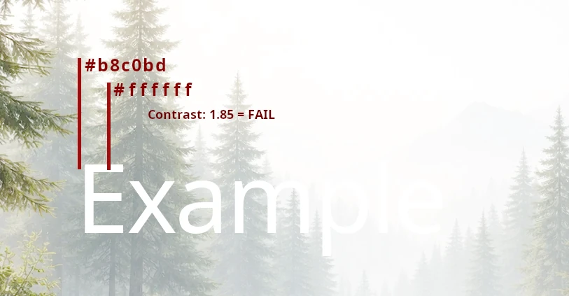
Also keep in mind that complex or sharp-edged backgrounds can make reading foreground text more difficult, even if it's passing contrast requirements.
This difficult to describe - but aim for allowing the HTML structure to be identical whether it's high or low
resolution. In short, avoid design decisions which force this to happen.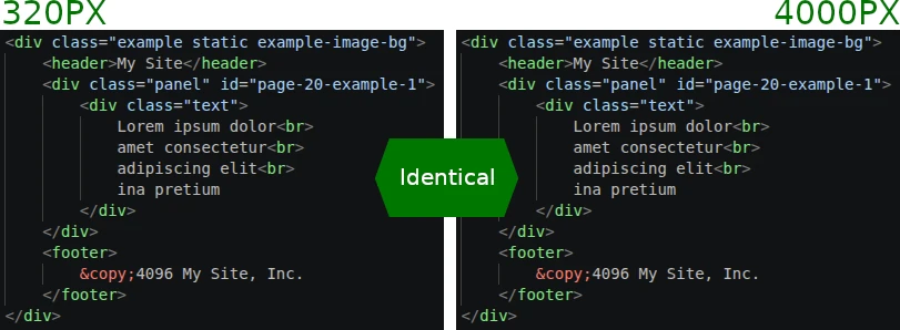
Column collapsing typically follows a nested left-to-right top-to-bottom pattern (which the 12-column grid frameworks use).
Left Sidebar
ABCRight Content
Placing blocks or elements where they wouldn't go under normal circumstances can confuse the order.
Left Sidebar
ABCRight Content
This doesn't just affect the order of content from an accessibility/keyboard-navigation order, but sometimes it requires the developer to code and integrate two different constructions into the HTML and CMS templating.
This results in a larger DOM tree size for the browser to deal, and creates more development time and technical debt for the developer to figure out how to integrate into the CMS.
                    ---
                        Left Sidebar
                        A
                        B
                        C
                    ---

                        Right Content


                                D
                                E
                                F


                                G
                                H


                    ---
                        Left Sidebar (copy)
                        A
                        B
                        C
                    ---
Maybe this can be done with the CSS "order" property instead of two separate copies, but that results in a confused ordering for those navigating with a keyboard, but visually viewing the screen - making a separate, but properly ordered copy, virtually mandatory.
Left Sidebar
ABCRight Content
Left Sidebar (copy)
ABCPay attention to how the relative sizes the components seem "right" versus each other in the original presented design.
A "screen view" is added to show what's above-the-fold versus below-the-fold on a typical 16:9 horizontal screen.
Allow component rows go to the edge of the monitor/screen.
Allow component rows go scale up to a maximum width.
Some components stretch - some don't.
Everything scales the same amount, including padding, font sizes, border witdths, etc. The biggest issue is that eveything becomes rediculously large on large screens.
Most front-end frameworks use a 12-column grid system.
Front-end frameworks are only useful
if the designs deliberately incorporate and adhere to the framework's tenets.
Note: This relates heavily to the quesiton of prime-number column count. Namely, that prime numbered columns (outside of 2) does not evenly fit into a 12-column grid structure.
Similar to other warnings on this page, the amount of content in each panel can make the design awkward. Prepare for this.
Note: This relates heavily to the quesiton of using a standard grid. Namely, that prime numbered columns (outside of 2) does not evenly fit into a 12-column grid structure.
Because there's no even breakdown, we're left having lopsided presentation.
A column count of 4 can subdivide more evenly.
Most front-end frameworks use a 12-column grid system.
Front-end frameworks are only useful
if the designs deliberately incorporate and adhere to the framework's tenets.
Note: This relates heavily to the quesiton of grid systems.
Similar to other warnings on this page, the amount of content in each panel can make the design awkward. Prepare for this.

Having some kind of box/outline can change the dynamics of the presentation.
Lorem ipsum dolor sit amet, consectetur adipiscing elit. In pretium, lacus vitae commodo cursus, orci mi pulvinar sem, et egestas elit dui pellentesque ipsum. Aliquam eget ex ac eros dapibus semper. Morbi laoreet blandit sapien. Pellentesque varius faucibus leo ut ullamcorper. Sed lacinia nunc tempor, dignissim arcu ut, faucibus massa. Praesent enim nunc, pretium in dapibus vitae, tempus sit amet dui. Duis sed urna sapien.
Lorem ipsum dolor sit amet, consectetur adipiscing elit. In pretium, lacus vitae commodo cursus, orci mi pulvinar sem, et egestas elit dui pellentesque ipsum. Aliquam eget ex ac eros dapibus semper. Morbi laoreet blandit sapien. Pellentesque varius faucibus leo ut ullamcorper. Sed lacinia nunc tempor, dignissim arcu ut, faucibus massa. Praesent enim nunc, pretium in dapibus vitae, tempus sit amet dui. Duis sed urna sapien.
Lorem ipsum dolor sit amet, consectetur adipiscing elit. In pretium, lacus vitae commodo cursus, orci mi pulvinar sem, et egestas elit dui pellentesque ipsum. Aliquam eget ex ac eros dapibus semper. Morbi laoreet blandit sapien. Pellentesque varius faucibus leo ut ullamcorper. Sed lacinia nunc tempor, dignissim arcu ut, faucibus massa. Praesent enim nunc, pretium in dapibus vitae, tempus sit amet dui. Duis sed urna sapien.
Also: beware of dropdown panels that go offscreen.
Lorem ipsum dolor sit amet, consectetur adipiscing elit. In pretium, lacus vitae commodo cursus, orci mi pulvinar sem, et egestas elit dui pellentesque ipsum. Aliquam eget ex ac eros dapibus semper. Morbi laoreet blandit sapien. Pellentesque varius faucibus leo ut ullamcorper. Sed lacinia nunc tempor, dignissim arcu ut, faucibus massa. Praesent enim nunc, pretium in dapibus vitae, tempus sit amet dui. Duis sed urna sapien.
Lorem ipsum dolor sit amet, consectetur adipiscing elit. In pretium, lacus vitae commodo cursus, orci mi pulvinar sem, et egestas elit dui pellentesque ipsum. Aliquam eget ex ac eros dapibus semper. Morbi laoreet blandit sapien. Pellentesque varius faucibus leo ut ullamcorper. Sed lacinia nunc tempor, dignissim arcu ut, faucibus massa. Praesent enim nunc, pretium in dapibus vitae, tempus sit amet dui. Duis sed urna sapien.
Lorem ipsum dolor sit amet, consectetur adipiscing elit. In pretium, lacus vitae commodo cursus, orci mi pulvinar sem, et egestas elit dui pellentesque ipsum. Aliquam eget ex ac eros dapibus semper. Morbi laoreet blandit sapien. Pellentesque varius faucibus leo ut ullamcorper. Sed lacinia nunc tempor, dignissim arcu ut, faucibus massa. Praesent enim nunc, pretium in dapibus vitae, tempus sit amet dui. Duis sed urna sapien.
Lorem ipsum dolor sit amet, consectetur adipiscing elit. In pretium, lacus vitae commodo cursus, orci mi pulvinar sem, et egestas elit dui pellentesque ipsum. Aliquam eget ex ac eros dapibus semper. Morbi laoreet blandit sapien. Pellentesque varius faucibus leo ut ullamcorper. Sed lacinia nunc tempor, dignissim arcu ut, faucibus massa. Praesent enim nunc, pretium in dapibus vitae, tempus sit amet dui. Duis sed urna sapien.
Lorem ipsum dolor sit amet, consectetur adipiscing elit. In pretium, lacus vitae commodo cursus, orci mi pulvinar sem, et egestas elit dui pellentesque ipsum. Aliquam eget ex ac eros dapibus semper.
Lorem ipsum dolor sit amet, consectetur adipiscing elit. In pretium, lacus vitae commodo cursus, orci mi pulvinar sem, et egestas elit dui pellentesque ipsum. Aliquam eget ex ac eros dapibus semper. Morbi laoreet blandit sapien. Pellentesque varius faucibus leo ut ullamcorper. Sed lacinia nunc tempor, dignissim arcu ut, faucibus massa. Praesent enim nunc, pretium in dapibus vitae, tempus sit amet dui. Duis sed urna sapien.
If the design doesn't have a plan or space for smaller/larger widths, the design quickly breaks. What the developer supposed to do if there's no room at lower resolutions?
Lorem ipsum dolor sit amet, consectetur adipiscing elit. In pretium, lacus vitae commodo cursus, orci mi pulvinar sem, et egestas elit dui pellentesque ipsum. Aliquam eget ex ac eros dapibus semper. Morbi laoreet blandit sapien. Pellentesque varius faucibus leo ut ullamcorper. Sed lacinia nunc tempor, dignissim arcu ut, faucibus massa. Praesent enim nunc, pretium in dapibus vitae, tempus sit amet dui. Duis sed urna sapien.
Lorem ipsum dolor sit amet, consectetur adipiscing elit. In pretium, lacus vitae commodo cursus, orci mi pulvinar sem, et egestas elit dui pellentesque ipsum. Aliquam eget ex ac eros dapibus semper. Morbi laoreet blandit sapien. Pellentesque varius faucibus leo ut ullamcorper. Sed lacinia nunc tempor, dignissim arcu ut, faucibus massa. Praesent enim nunc, pretium in dapibus vitae, tempus sit amet dui. Duis sed urna sapien.
Lorem ipsum dolor sit amet, consectetur adipiscing elit. In pretium, lacus vitae commodo cursus,orci mi pulvinar sem, et egestas elit dui pellentesque ipsum. Aliquam eget ex ac eros dapibus semper. Morbi laoreet blandit sapien. Pellentesque varius faucibus leo ut ullamcorper. Sed lacinia nunc tempor, dignissim arcu ut, faucibus massa. Praesent enim nunc, pretium in dapibus vitae, tempus sit amet dui. Duis sed urna sapien.
Lorem ipsum dolor sit amet, consectetur adipiscing elit. In pretium, lacus vitae commodo cursus, orci mi pulvinar sem, et egestas elit dui pellentesque ipsum. Aliquam eget ex ac eros dapibus semper. Morbi laoreet blandit sapien. Pellentesque varius faucibus leo ut ullamcorper. Sed lacinia nunc tempor, dignissim arcu ut, faucibus massa. Praesent enim nunc, pretium in dapibus vitae, tempus sit amet dui. Duis sed urna sapien.
Conceptualize the design around rules - The design should be able to be fully recreated from verbal description, without a visual design provided. For example, a row of the page could be described as:
Communicate this to the developer, instead of relying on them to interpret the design, and guess at its behavior.